Universal Payment Request
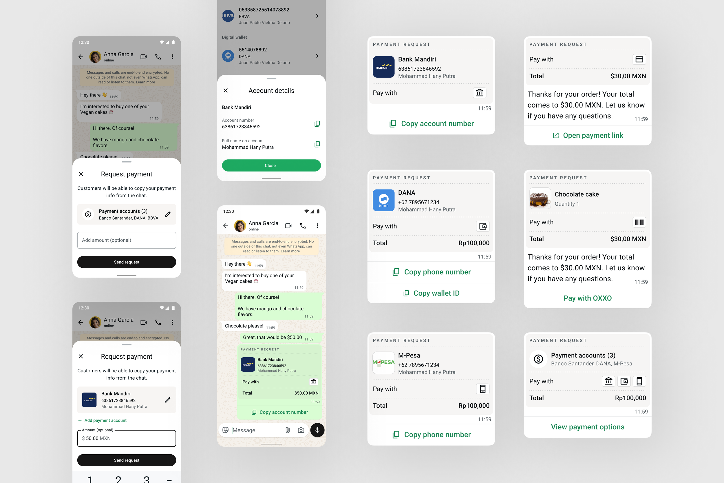
A modular payment request experience that helps businesses on WhatsApp get paid in 50+ countries.
My role & impact
Owned end-to-end design as the only designer, covering sellers and buyers across the WhatsApp Business App and Business API, on both iOS and Android.
Set the design direction. Replaced one-off country builds with reusable payment types that each market turns on through configuration, bringing launches down from 6 to 12 months to weeks.
Built a modular payment bubble. Designed one bubble for any number of payment options, currencies, and statuses that both small sellers and enterprise merchants use, then contributed it to the WhatsApp design system as reusable components.
Unblocked the Business AI launch. Designed a payment request experience that works in any market, giving the Business AI team what it needed to launch in 50+ markets with AI agents sending payment requests for businesses in chat.
Background
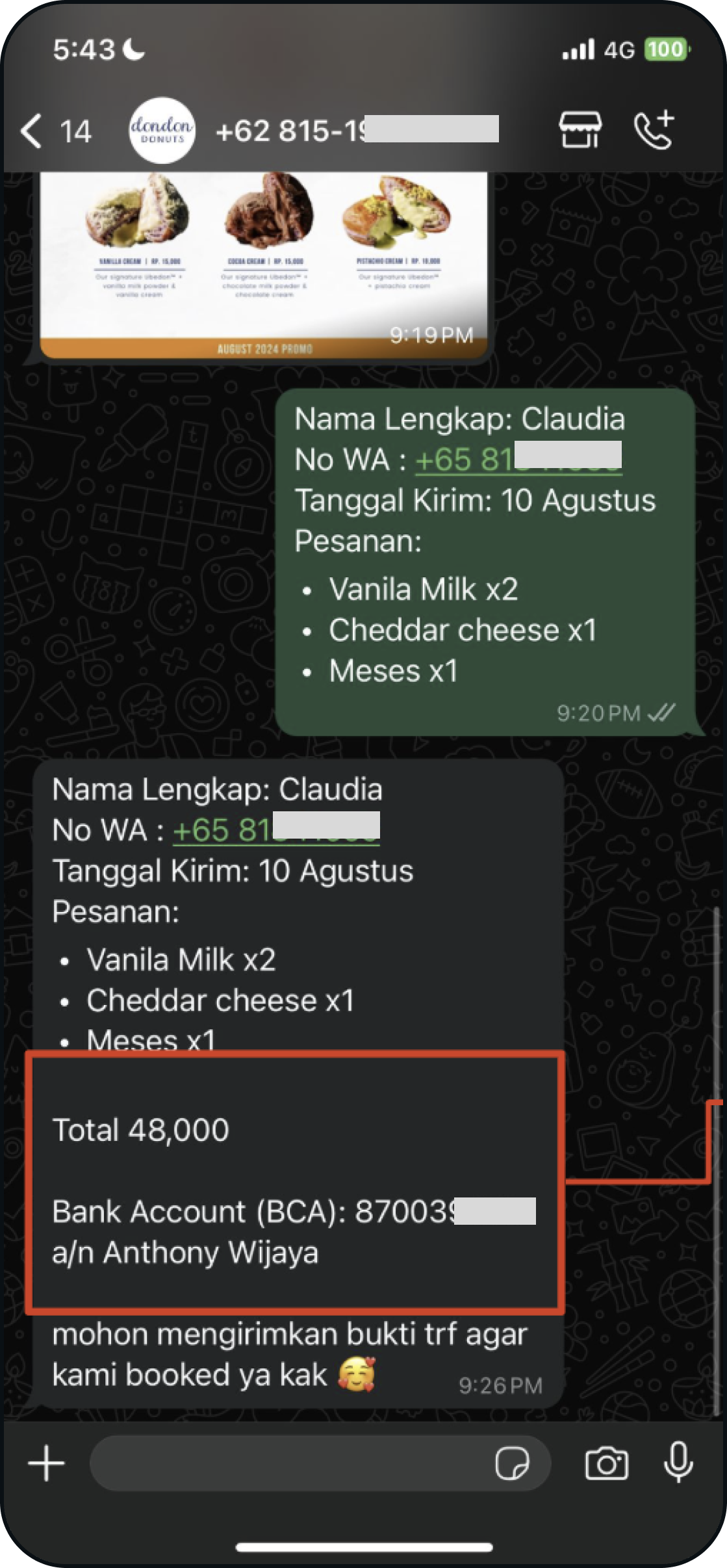
Example of seller sharing payment info in chat in Indonesia
Across the world, millions of small businesses run entirely on WhatsApp. The catalog is a camera roll. Customer service is a chat thread. The storefront is a phone number.
However, getting paid is still manual. Sellers type out bank account numbers, wallet IDs, and phone numbers by hand in chat after chat, and buyers copy those details into a separate banking app one character at a time. There's no structure and no clear sign that a request is legitimate, and one wrong digit means a failed payment.
WhatsApp had solved this in Brazil and India; each had deep, purpose-built payment platforms, and each took large teams and 6 to 12 months of bespoke engineering, legal, and design work to launch. With the business planning to expand payments to 50+ countries, building market by market was never going to get there, and the Business AI team couldn't offer payments in chat without a structured way to request them.
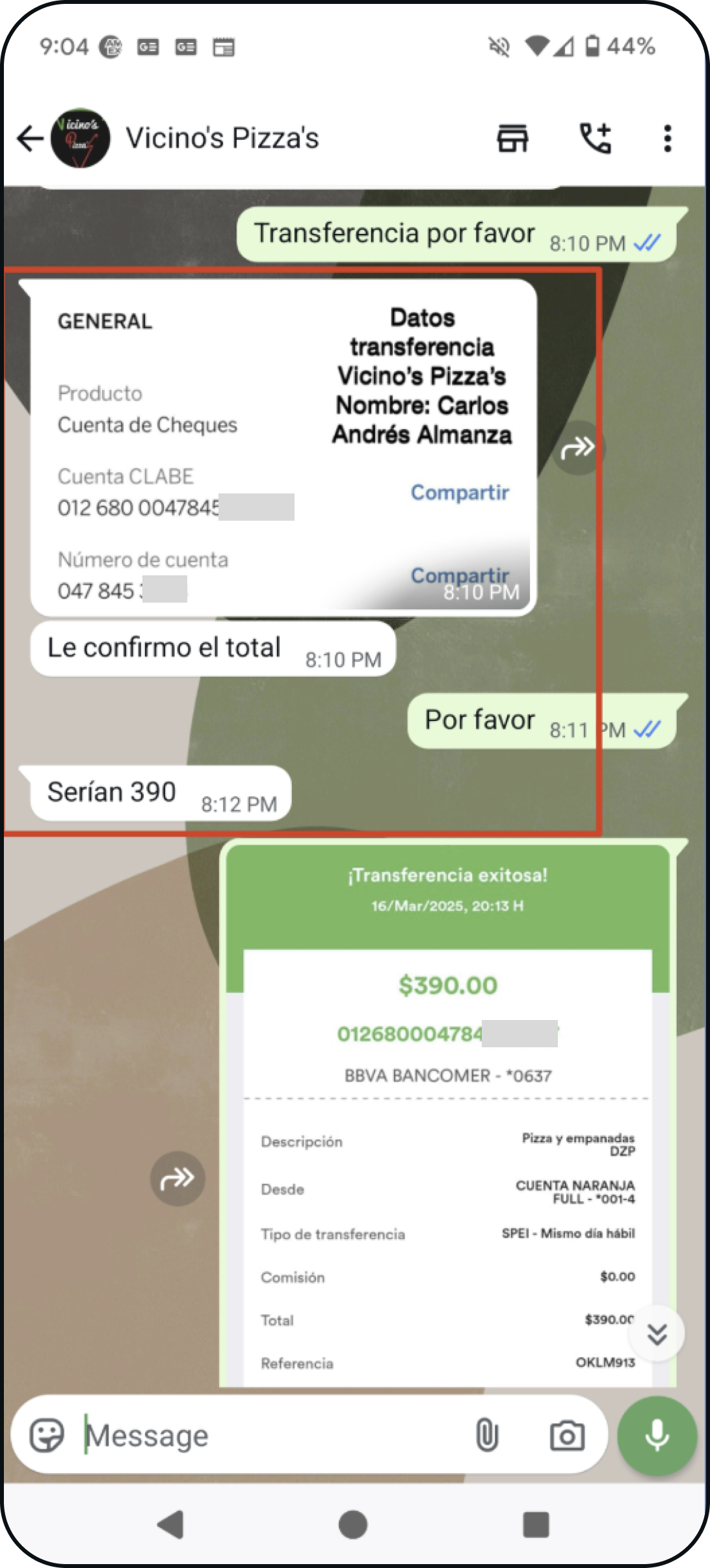
Example of seller sharing payment info via image in Mexico
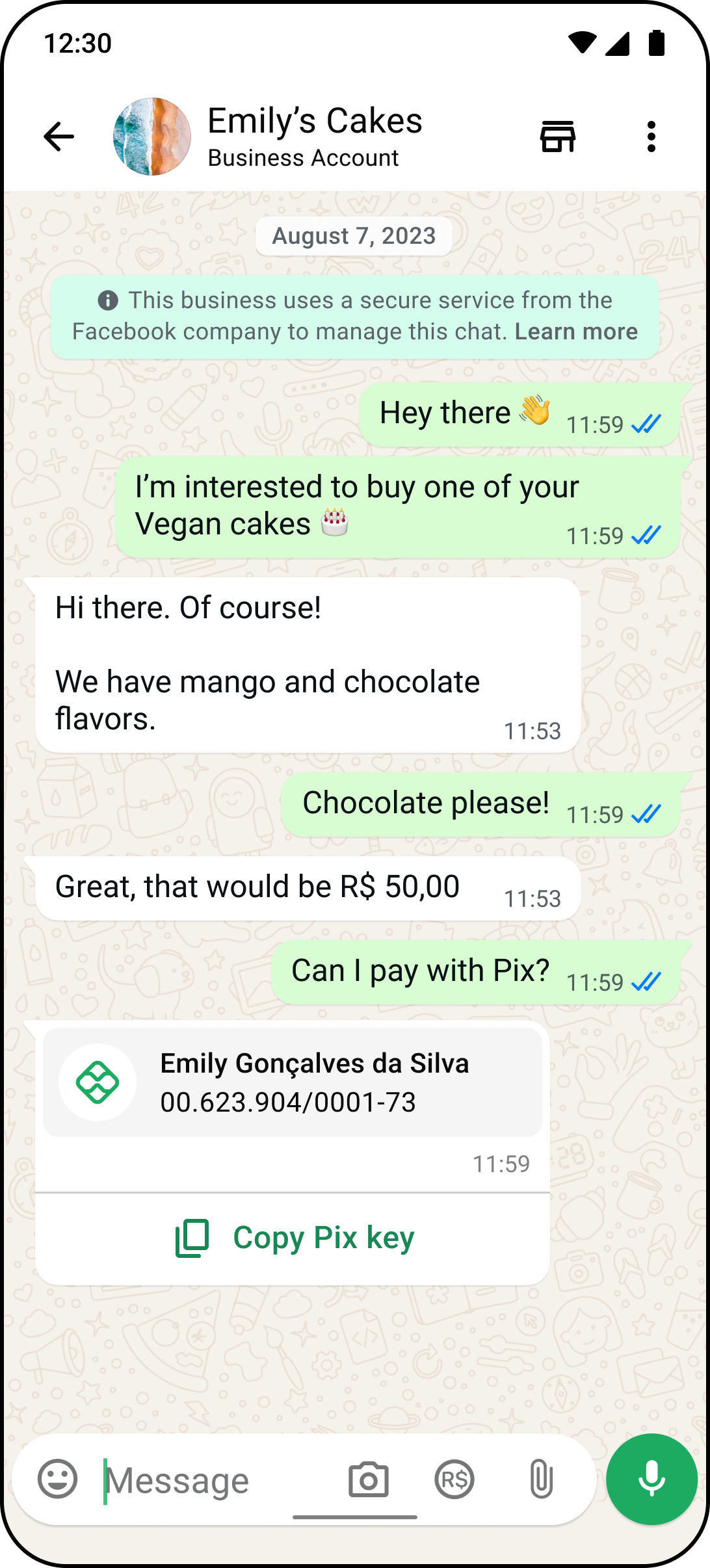
Existing experience of seller sharing Pix key in Brazil
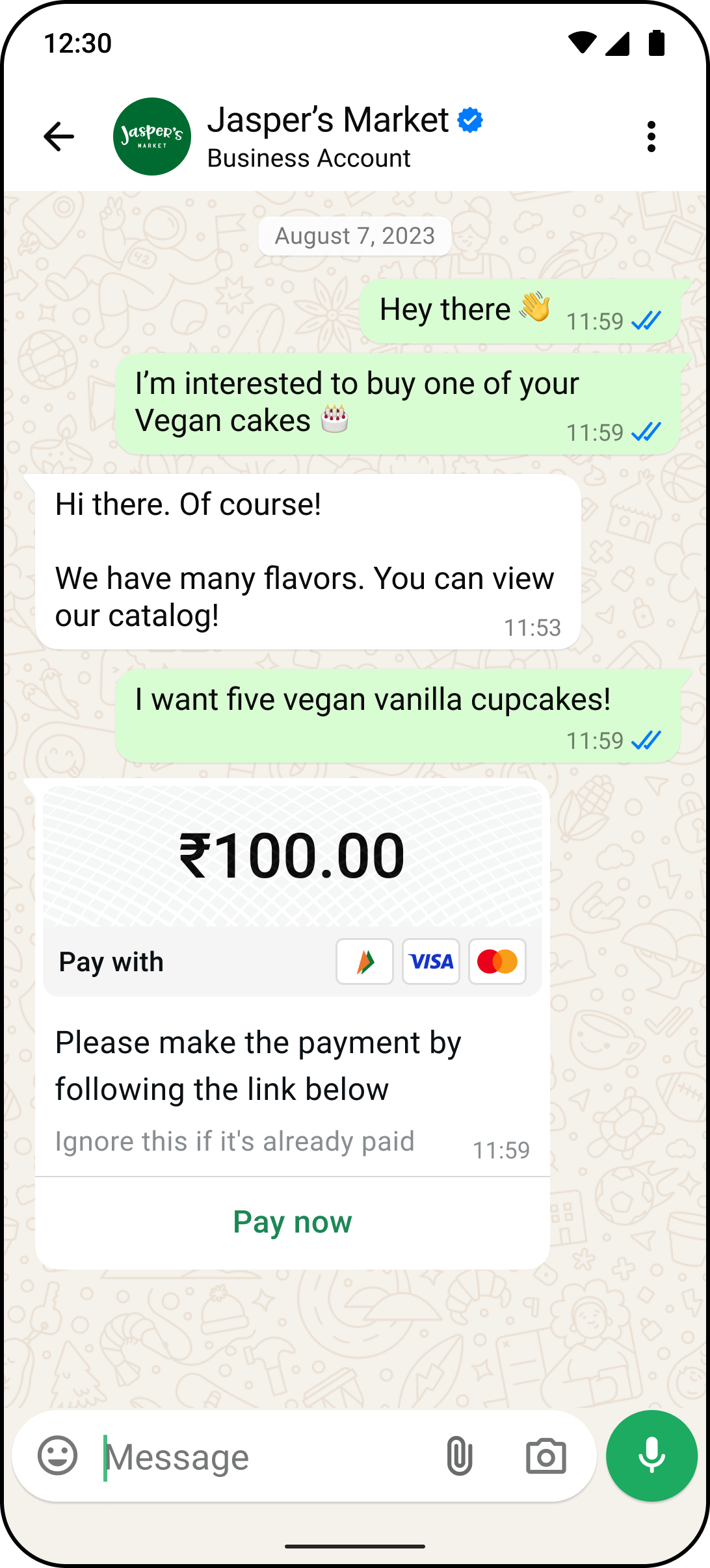
Existing experience of API merchants sending payment link in India
Design the payment type, configure the market
While studying how sellers get paid in different countries, I noticed their behavior was nearly the same everywhere. A seller shares their details and asks to be paid. What changed from country to country was the payment infrastructure underneath. Mexico runs on bank transfers, Indonesia runs on banks and digital wallets, and much of Africa runs on mobile money tied to a phone number.
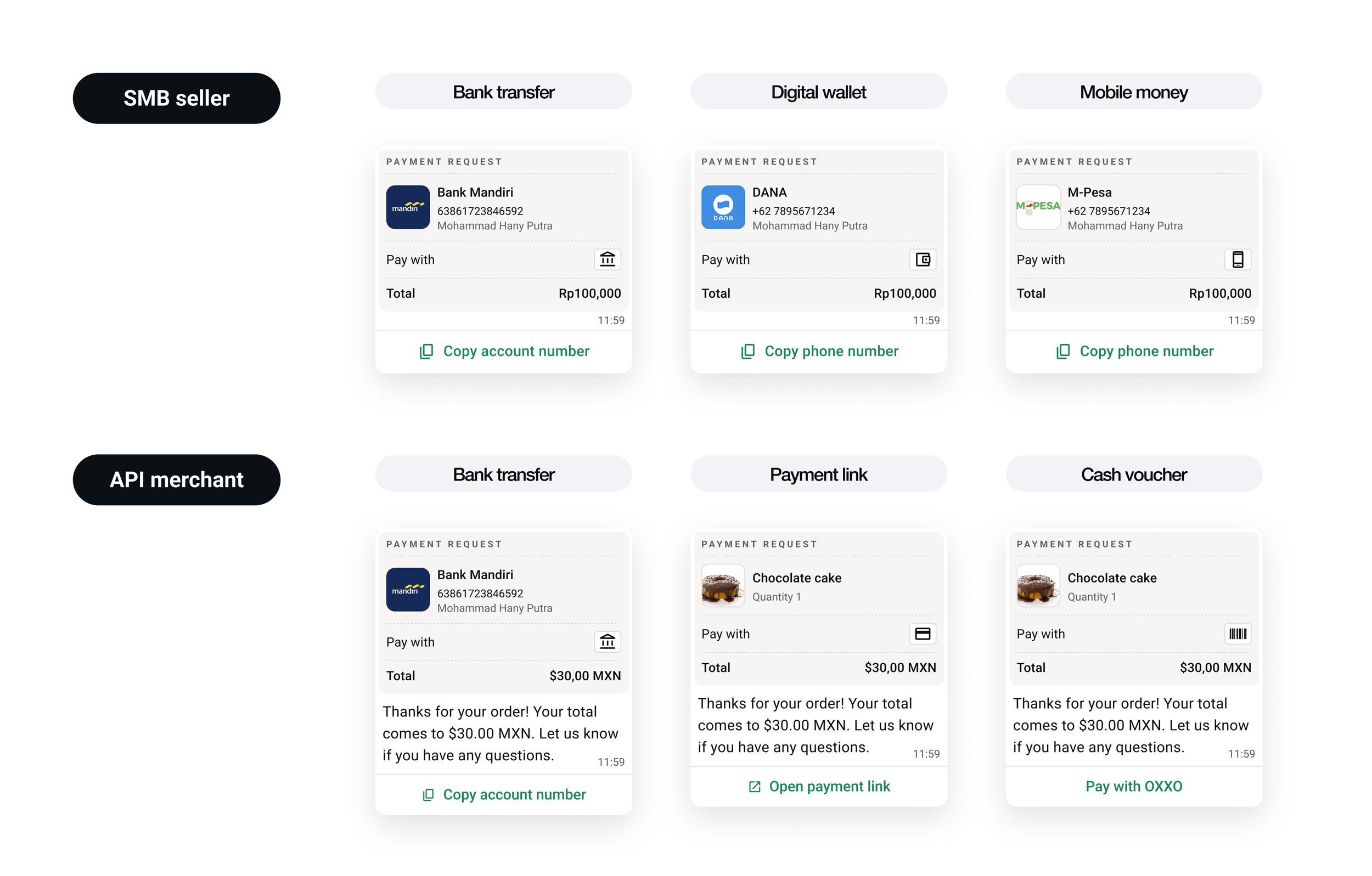
So I designed around payment types instead of countries. Small sellers can share bank accounts, digital wallets, and mobile money numbers, and enterprise merchants can also send payment links and cash vouchers. Each type is a self-contained module that engineering builds once and turns on per market through configuration. This also makes local regulation easier to handle. If one country restricts a payment method, it gets switched off there while every other market keeps running.
One product constraint shaped the whole experience. WhatsApp shares the payment details, and the money moves between the buyer's and seller's own banking or wallet apps. That kept the product clear of payment licensing in each country, and it made "copy and pay" the starting experience everywhere.
One bubble for every payment
For sellers
Set up once, request in one tap
For buyers
Pay with confidence
The biggest tradeoff
Launch everywhere first
Built to grow
Tradeoff
Copying details into another app is less seamless than paying inside the chat. I accepted that because it let us launch in weeks, and I designed the starting experience so richer ones could be added later without starting over.
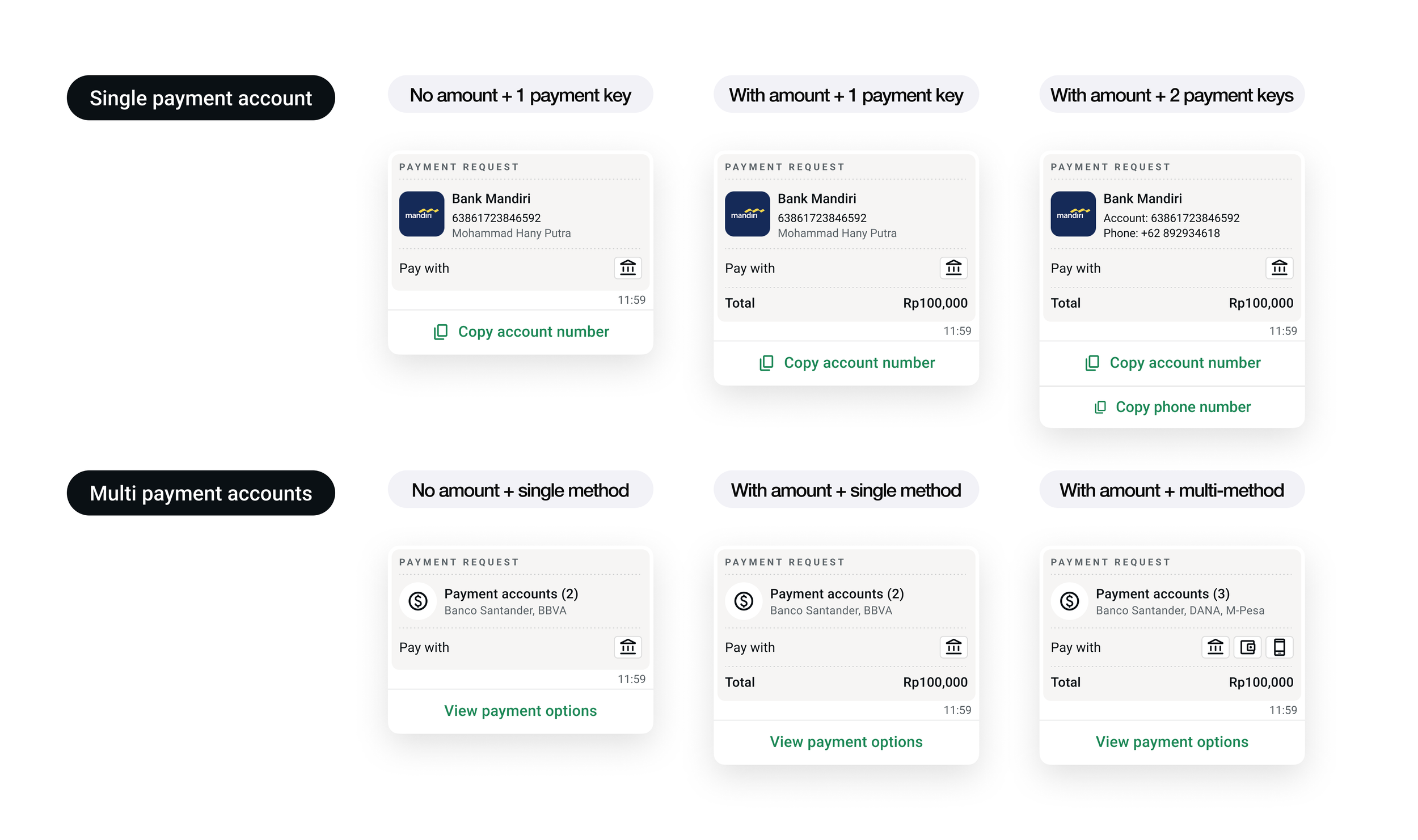
Everything comes together in the payment bubble. Every bubble has the same core pieces: the business name with a clear "Payment request" label, the amount in local currency, icons for the available payment methods, the merchant's message, and a button. Order details, product images, and multiple accounts show up only when a request needs them.
The button changes with the request. A single bank account shows "Copy account number." Several accounts show "View payment options." A payment link opens checkout, and a cash voucher opens a barcode. The same bubble works for a seller tapping in the Business App and for an enterprise sending requests through the API, so every improvement reaches both. The bubble and its payment options are now components in the WhatsApp design system.
Tradeoff
Brazil and India used provider logos like Pix, UPI, and Visa. Those are familiar locally, but they mean nothing in most other markets, and each one needs licensing. I switched to generic icons for bank, wallet, card, and barcode. We gave up instant brand recognition, and in return the same icon set works in every market with no local artwork.
Sellers start from the attachment tray they already use in chat. They pick an account type, search for their bank, wallet, or mobile money provider, and enter their details once. After that, a payment request takes one tap, with an optional amount.
Onboarding had to work with thousands of providers, each with its own rules. The flow adjusts to each one. If a market supports only one account type, that step is skipped. If a bank lets sellers use either an account number or a phone number, an "Add account by" choice appears, and otherwise the form goes straight to the one field that applies. Bank accounts, wallets, and mobile money all follow the same logic, and sellers can save up to 10 accounts across all three.
Tradeoff
A single adaptive flow means some providers get a more generic form than a custom-built one would offer. In return, one flow covers every provider in every market, and new providers are added through configuration.
Buyers had been receiving raw text with no sign that it was legitimate. The "Payment request" label makes it clear they're being asked to pay, and the business name shows who's asking. Copy buttons replace manually selecting account numbers, which was the biggest source of friction and failed payments.
When a merchant offers several options, the buyer sees them grouped by type, each with its own copy button. Payment links open a familiar checkout page. Cash vouchers show a barcode, amount, and expiration date that buyers present at a convenience store counter, which brings in customers who don't use banks or prefer cash.
For the payment options sheet, I weighed expanding account details in place against opening a second sheet on top. I took both options to the WhatsApp design system team, and we settled on a pattern that other teams can reuse.
The largest decision was about scope. Market-specific designs would have felt more at home in each country, but they would have brought back the slow, one-country-at-a-time pace we were trying to leave behind. Timing made the choice clearer. The Business AI team was launching in these same markets and needed payment requests ready so AI agents could send them for businesses.
I pushed for one design that works in every market and worked closely with engineering to keep every decision buildable once and configurable everywhere. We planned to go deeper in the markets where adoption or business investment justified it. Being available everywhere came first, and refinement came next.
Merchants integrate once, and buyers get a better experience as the platform adds features, with no extra work from the merchant. Today a buyer copies an account number. Next, the same request can open the buyer's banking app with everything filled in. After that, payment can be confirmed right in the chat. Payment status was the first of these steps to ship, and it fit into the existing bubble.
Reflection
The real deliverable was a set of modular parts and clear rules for combining them, so any market can offer a trustworthy payment experience without a designer redrawing it. This project taught me that at this scale, the strongest design decisions are the ones nobody has to make again.